- Welcome to Cook'd and Bomb'd.

-
 I will not have it
by dontpaintyourteeth
I will not have it
by dontpaintyourteeth
[Today at 06:58:22 AM] -
 The Travails of Labour - The...
by Johnny Yesno
The Travails of Labour - The...
by Johnny Yesno
[Today at 06:52:48 AM] -
 Threelon Musk: pl3ase lik3...
by Poirots BigGarlickyCorpse
Threelon Musk: pl3ase lik3...
by Poirots BigGarlickyCorpse
[Today at 06:17:21 AM] -
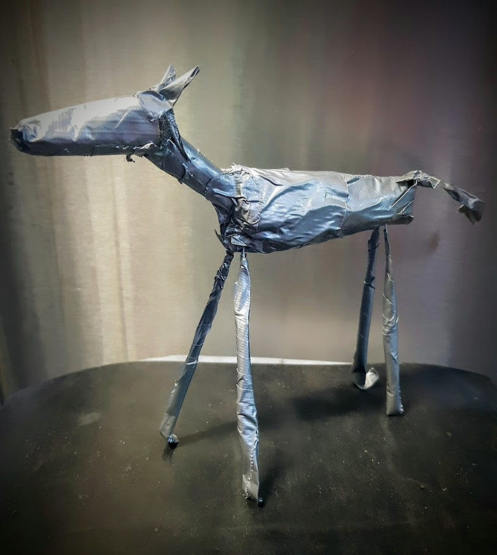 Things you have made with...
by PlanktonSideburns
Things you have made with...
by PlanktonSideburns
[Today at 06:12:52 AM] -
 Trans Mania: Graham Linehan...
by Hope of Avalon
Trans Mania: Graham Linehan...
by Hope of Avalon
[Today at 05:59:41 AM] -
 The All New Comics Thread...
by Small Man Big Horse
The All New Comics Thread...
by Small Man Big Horse
[Today at 04:33:23 AM] -
 Life After Oz (the HBO prison...
by Shaky
Life After Oz (the HBO prison...
by Shaky
[Today at 04:05:19 AM] -
Tarantino's Final Film - 'The...
by Small Man Big Horse
[Today at 04:00:43 AM] -
Comedy That's Changed Your...
by 13 schoolyards
[Today at 03:58:15 AM] -
 Who were the earliest openly...
by McFlymo
Who were the earliest openly...
by McFlymo
[Today at 03:53:55 AM]

Members
 Total Members: 17,819
- Latest: Jeth
Stats
- Total Posts: 5,578,499
- Total Topics: 106,671
- Online Today: 1,086
- Online Ever: 3,311
- (July 08, 2021, 03:14:41 AM)
Users Online
Users: 30Guests: 784Total: 814